User Interface Program
Benji Bank is a responsible banking application designed to adapt to mobile, tablet, and desktop interfaces.
Project Overview
Objectives: To develop 9 cohesive and responsive screens across 3 digital platforms. To acquire vital user interface design skills. The project was open-ended, only requiring that the screens implement a cohesive design system that conveys values of trust, clarity, and playfulness.
Solution: Produced 9 responsive screens that adapt to mobile, tablet, and desktop devices.
Role: UI designer
Timeline: 6 months
Tools & Skills: Figma | Responsive design | UI design | Design system | Wireframing | Mockups | Prototyping | Information architecture | Brand identity | Grid systems | Color theory | Typography | Iconography design | Interaction design | Design principles & elements |
Phase 1: Inspiration
Inspiration was collected to understand how the required values were approached in finance apps and comprehend the established responsive design conventions in use.
Values
As instructed, the final screens must convey values of trust, clarity, and playfulness.
Trustworthy: An overarching approach to trust was applying color psychology and utilizing transparent copy, and elements of security. Trust was evoked implicitly and explicitly.
Clear: Finance apps require hierarchy and structure to provide visual clarity to the abundant numerical data. Determining the function and designated action per page provided implicit clarity for users.
Playful: Bold color schemes, illustrations or 3D icons, and organic shapes demonstrate a playful UI approach. The little, whimsical incorporations of playful elements are what truly establish this value.
Phase 2: Design System
Once inspired, a design system was developed to convey the required values.
-
Typography
Legibility was prioritized when selecting a typeface. The typeface needed various weights to assist with hierarchy when applying various sizes for each device. SF Pro Display offered a vast range of weights and proved legible in various sizes. Heavier weights at larger sizes were essential for larger devices while smaller, thinner weights were best for the mobile platform. The clean characteristics of the sans serif typeface bring a simple and minimalist style to the interface.

-
Color
Opting for a clean, bright interface, the dynamic color scheme fortified the required values of trust and playfulness. The analogous colors are harmonious, yet contrast enough for hierarchical purposes. Many financial businesses utilize blue because it evokes calmness, stability, and trust. The purple and pink hues add a youthful element. The analogous colors are refreshing and bring a vibrance to the traditionally mundane, static approach to personal financing.

-
Iconography
Iconography is essential for mobile and tablet devices, so having icons that worked in various sizes was key. Solid icons were selected to contrast against the predominately white interface. Following the softened approach of the interface with rounded corners, the icons sought similar roundedness to maintain consistency across the visual elements.

-
Elements
Each device displayed informational graphs and tables. The mobile and tablet devices relied more on visual elements to lead the user through the app. Specifically, the navigation menus, filtering bars, and interactive buttons did the heavy lifting for these devices. The objective for these elements was to be legible in various sizes and have a clear function for each element.

Phase 3: Design Solutions
The final 9 responsive screens for mobile, tablet, and desktop devices.
Mobile
-
My Cards
This page displays the user’s cards and corresponding account balances. The contrasting shapes and fills between the cards and the call-to-action button successfully funnels the user’s attention to the primary action for this screen.

-
My Transactions
This screen provides a concise breakdown of the user’s monthly spending. The transactions card displays the account’s fluctuating funds. The hierarchy successfully structures the numerical data to be quickly comprehended.

-
My Spending
This screen displays various numerical breakdowns. This layout is simple and digestible for the user to quickly understand and comprehend. Specifically, a trend of the user’s weekly spending, their budget breakdown, and progress on their savings goal.

Tablet
-
My Cards
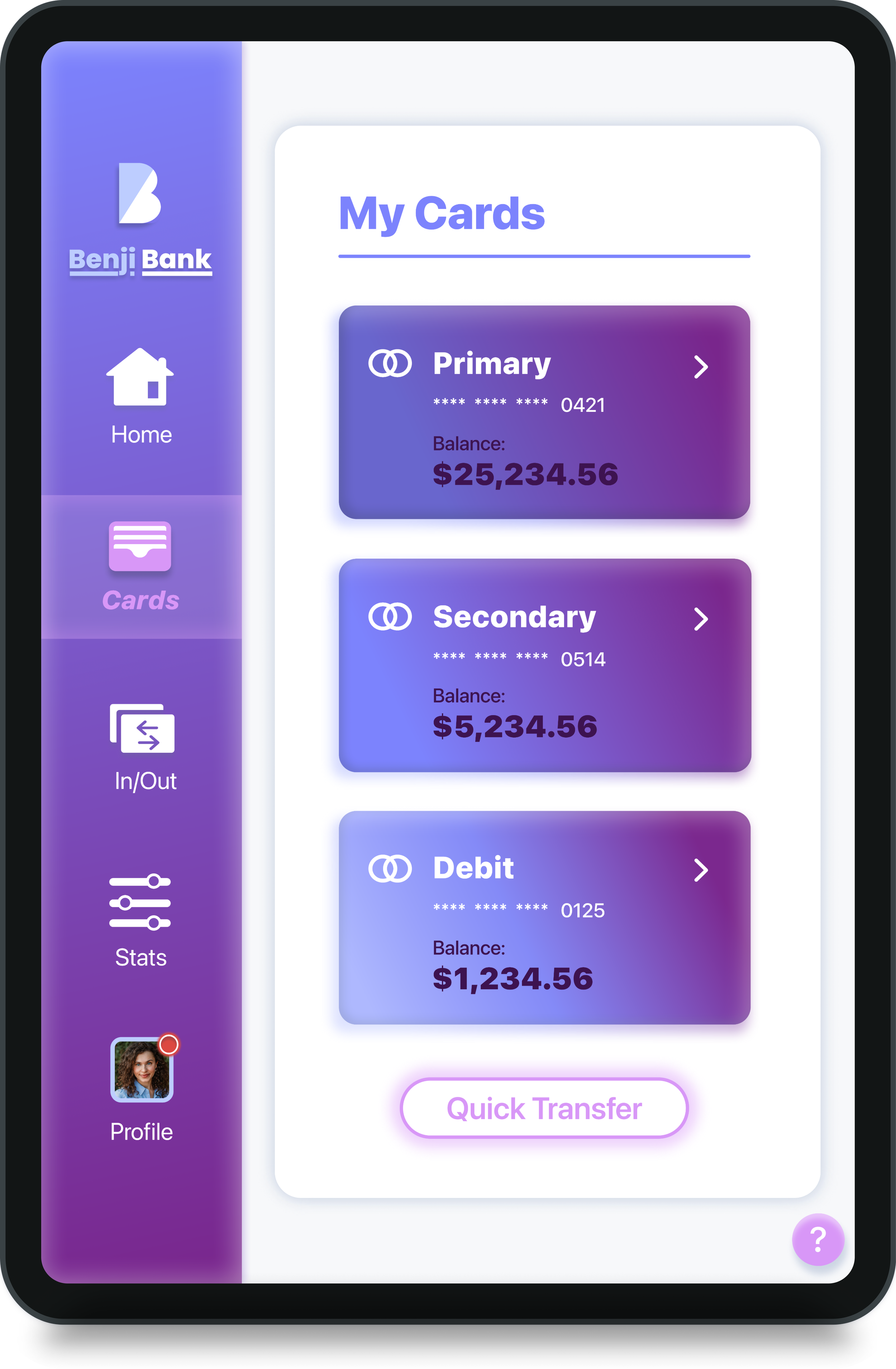
Like the mobile app, the user’s cards and balances are displayed. The tablet layout differs with its condensed, vertical navigation bar, prompting the user to hold the tablet vertically. Like the mobile app, the call-to-action button is placed towards the bottom of the screen, thus in a zone of easy reachability for the user.

-
My Transactions
The screen’s layout follows suit of the mobile app. In both the tablet and mobile app, a nice feature is at the top of the transaction chart. This centered bar allows users to extend the table to see more information and scroll less. The user can adjust how long the table is and how much information is displayed at once.

-
My Spending
Bearing resemblense to the mobile app, the three stacked information cards lent themselves nicely to the tablet layout. The cards’ vertical stacking prompts the user to scroll and explore the content. Furthermore, the vertical navigation bar enforces this verticality and orients users to view the app as such on this device.

Desktop
-
My Cards
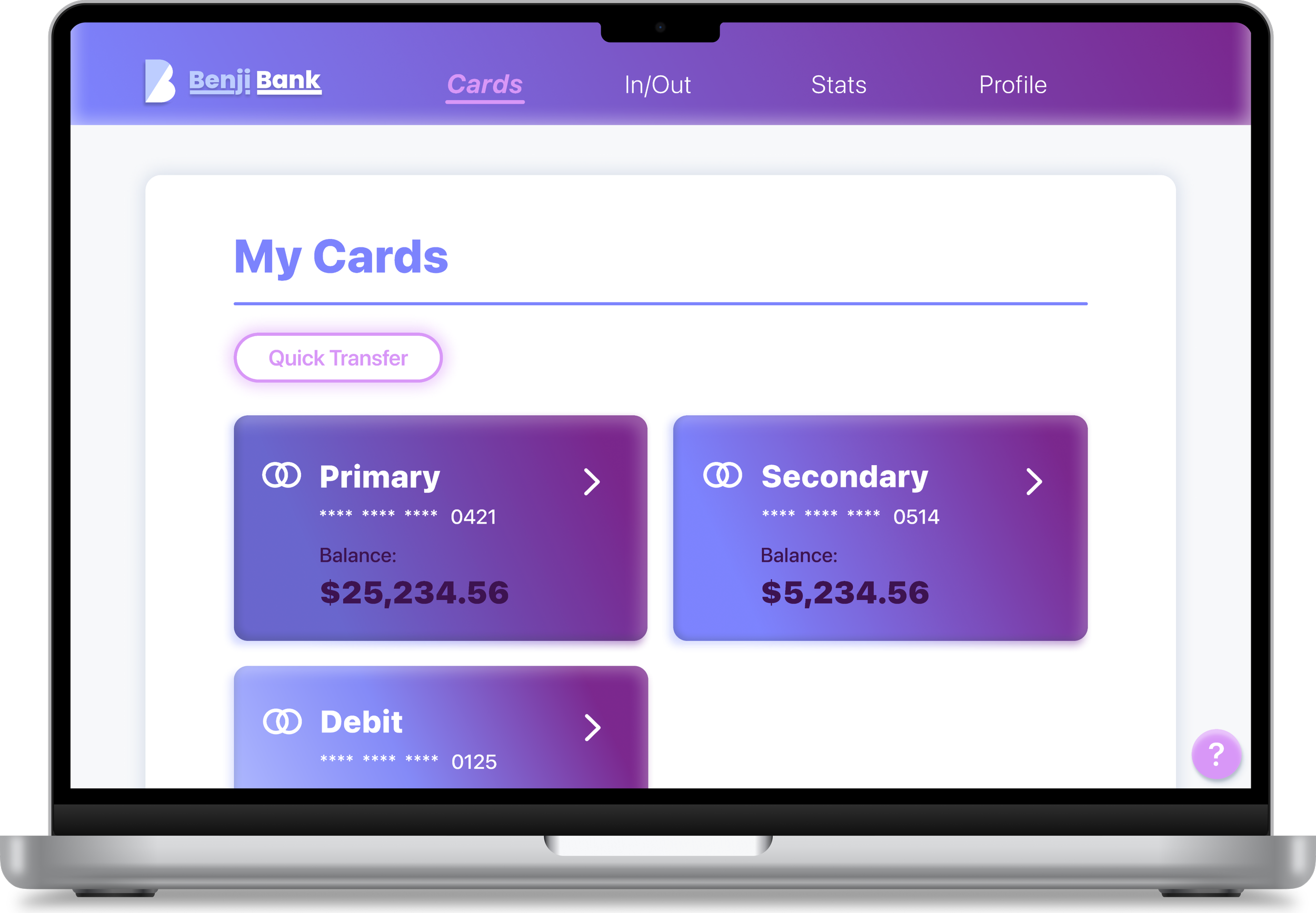
This screen’s layout prioritizes a horizontal orientation over the vertical orientation of the mobile and tablet devices. Unlike the previous devices, the call-to-action button appears before the cards. The horizontal navigation bar follows UI standards and is how users understand and operate desktop screens. The desktop menu bar allows for larger text, so the previous navigational icons are removed for greater legibility and to follow UI standards.

-
My Transactions
This screen demonstrates how content is scanned differently based on the device. The narrow mobile and tablet screens promote scanning down the screen. Meanwhile, the wider dimensions of the desktop enforce scanning left to right. The split card layout follows desktop layout conventions that prioritize horizontal over vertical scanning. Likewise, sticky elements commonly reside on the right side with scrollable elements to the left, as demonstrated here.

-
My Spending
This screen adheres to the layout reconfigurations for responsive design. The mobile and tablet devices stacked the three cards for this screen. Due to the desktop’s left-to-right reading nature, it was logical to arrange the cards side-by-side rather than stacking them. The full-width graph suits the natural movement of the line as users look left to right. Likewise, the cards below further enforce that scanning pattern associated with the desktop’s width.

Solutions & Conclusions
The final screens fulfill the project requisites of developing a responsive banking app that demonstrates values of trust, clarity, and playfulness.
Trust: The brand overtly derived trust from the color palette and its psychological associations. The medium blue and dark purple evoked trust, stability, loyalty, and integrity. The layout further conveyed trust. Everything the user needs is accessible and explicit on the page. Nothing is hidden from the user—there is transparency provided throughout the app.
Clarity: Clarity was evident and enforced by the consistent hierarchical structure. From this, users grasped the contents of every page and understood the necessary actions to accomplish their tasks. With the minimalist design, every included element serves a function, thus keeping the user on task without unnecessary distractions.
Playfulness: Like trust, playfulness was expressed via color. The youthful and vibrant colors brought a light-hearted tone to the app. Finance brands traditionally embrace classic dark blue and green colors, associating a drab banality with banking. Seeking a refreshing approach, Benji Bank expressed playfulness through its energetic colors. The app adds a visually engaging flair to banking.
Successes: This project successfully maintains consistency across the screens and devices. The contents adapt accordingly for each device while providing continuity between the interfaces. This visual relatedness among screens is most apparent in the logo and navigation menus that change formats to fit the desired device best. As a liaison between the responsive apps, the tablet screens blended the icons of the mobile device with the desktop’s text-based navigational menu. Incorporating mobile and desktop elements, the tablet’s interface smooths the transition between devices, creating a successful, responsive solution.
Takeaways: From inspiration to the final screens, this project delivered learning opportunities at every step. Most importantly, I understood that a UI designer must have various areas of expertise within the visual design realm to create a cohesive interface. Excellently designed work goes unnoticed and provides a seamless experience for the user. That was my objective during this project; hopefully, someone using this app would agree.

